
When first approached my client, I ask her what is that wanted for Wellness for Growth to be know for, basically was something easy to remember, knowledgeable and holistic. Clean detailed icons and a really nice typeface, the color pattern we choose was really clean, it was clear we want pastel tones. The result was simple and explicative, feminine and fresh.
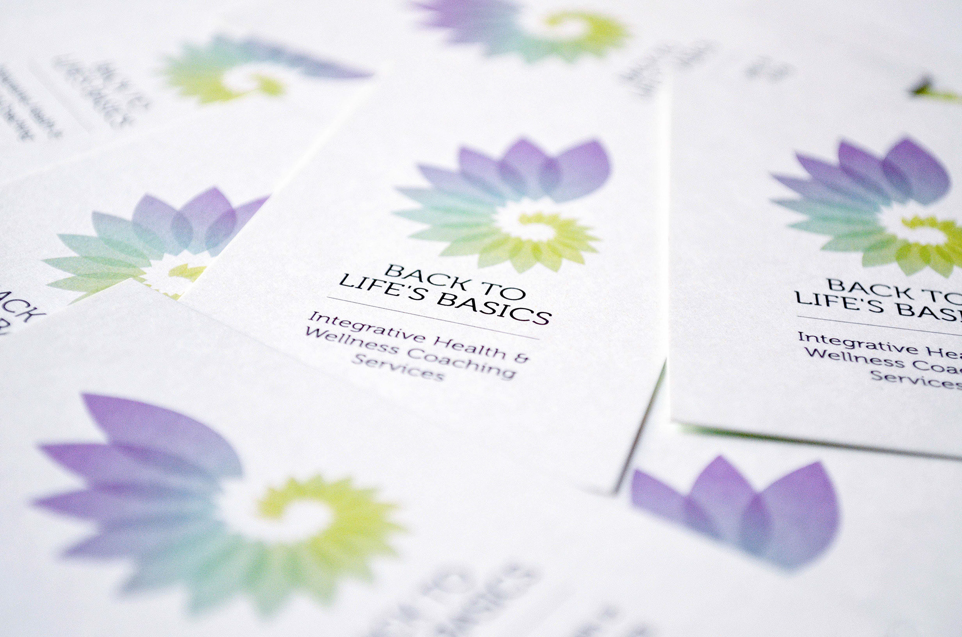
I designed a few clean icons to represent the connection, communication, and different approach. This was the occasion to elaborate a distinctive brand icon and it came pretty natural and clear.
I designed a few clean icons to represent the connection, communication, and different approach. This was the occasion to elaborate a distinctive brand icon and it came pretty natural and clear.